
SkinSprout
Track your skincare history to get personalized product recommendations.
TIMELINE
May 2026
TEAM
1 designer (me!)
ROLE
Product design
Visual design
SKILLS
Product design
Branding
THIS PAGE IS CURRENTLY A WIP!
01 / Initial Planning
The Problem
Finding skincare that actually works for your skin shouldn't be this difficult.
But the industry is built to sell, not to inform. Influencers promote anything that would give them a brand deal, and marketing is hinged on exaggerations.
The result: Users end up buying based on who has the biggest following, not what they actually need.
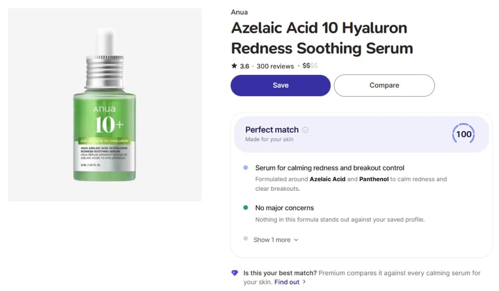
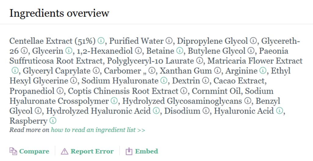
Even users who do know skincare have a hard time. Ingredient lists are dense and never optimized for a consumer.
Users are stuck choosing between two bad options: trust marketing they know is unreliable, or self-educate through a system that was never built to be understood.
13/20
people discover products on social media.
10/13
find the products ineffective.
9/10
struggle to figure out why.
The Solution
A mobile app that allows users to track products, and recommends future products based on their skincare history.
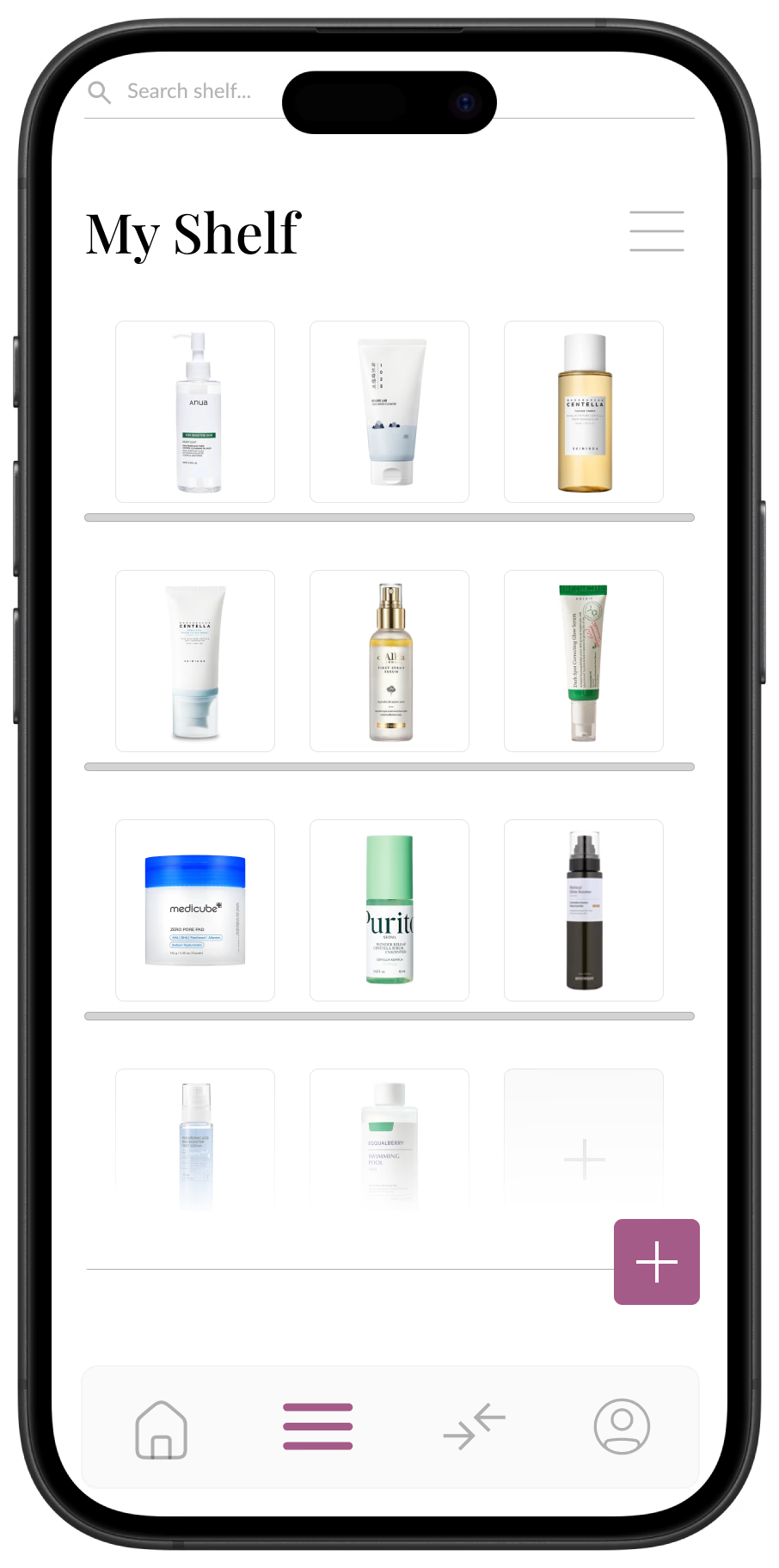
A tracking system where you can log your skincare in your "shelf".
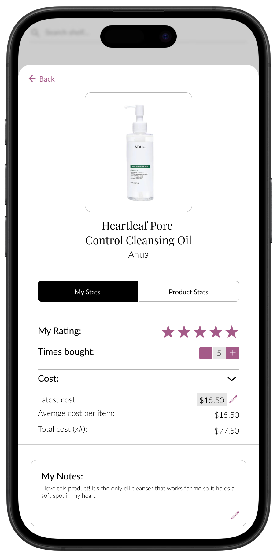
Product info, based on your own opinions and other general facts.
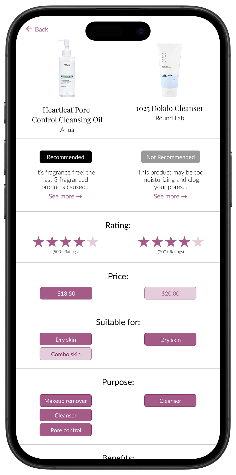
A comparison page listing out which product is recommended — and the reasoning based on your skincare history.
02 / Research
Affinity Mapping
Through analysis of 20 user survey responses (aged 17-24), I mapped out the responses to better understand the problem.
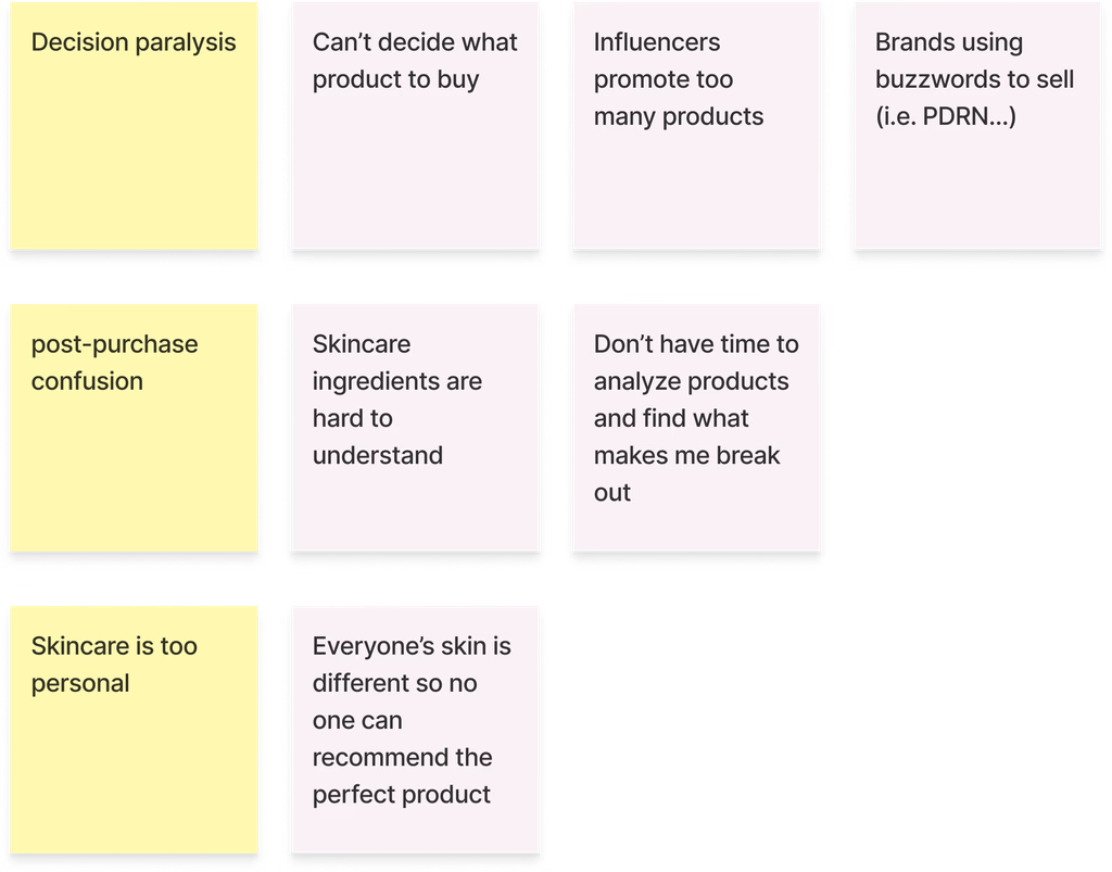
This revealed 4 key insights:
Too many voices with no way to weigh them.
Influencers, brands, and buzzwords all compete for trust, leaving users unable to tell good advice from marketing.
Generic advice doesn't work for everyone.
Broad categories like “oily” or “sensitive” hide the fact that two people can react completely differently to the same product.
Ingredients are unreadable, so cause and effect stays hidden.
Users can't connect a reaction to its cause when they don't understand what's in the product to begin with.
Without a record, past products vanish, so nothing gets learned.
People can't recall what they've tried before, and tracking tools don't have enough payoff to motivate real use.
Personas
Abby
- Skincare intermediate (understands to an extent)
- Loves trying new skincare
Pain Points:
- Forgets what products she's tried before and whether it worked or not
- Spends too much $ on skincare
- Difficulty finding new products that work
- Can't afford a dermatologist
Needs:
- A way to track her skincare history
- Customized skincare recommendations
Grace
- Skincare beginner (knows nothing about skincare)
Pain Points:
- Wants to get into skincare but there's too much to learn!
- Overwhelmed by the amount of products
- Uses products that don't work
Needs:
- A simple app that provides skincare info
- A way to track her skincare progress
- Customized skincare recommendations
Competitive Analysis
Finally, I needed to understand what the market currently looks like, so I conducted some quick competitive analysis!
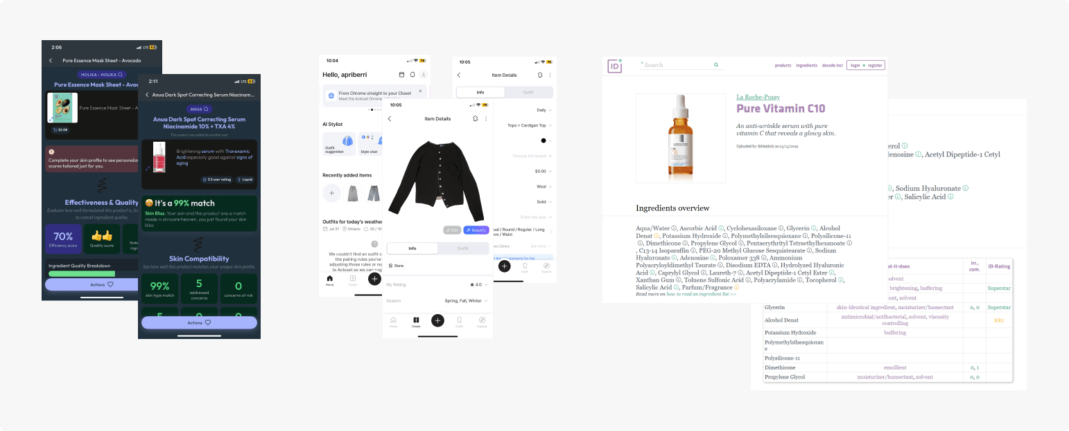
| Criteria | Skin Bliss | ACloset | Incidecoder |
|---|---|---|---|
| Information hierarchy | Weak; competing signals, hard to scan | Strong; clean and easy to read | Strong; but dense with raw data |
| Effort to reach value | Low effort; but the payoff isn't credible | High effort; long intake before any payoff | Low effort; but the payoff isn't personal |
| Personalization | Claims personalization; doesn't show why | Personalizes via upfront form | None; same content for every user |
| Trust / transparency | Low; no reasoning behind match scores | Not applicable; not a rec engine | High on ingredients; low on relevance |
The Gap
None of the three apps offer a recommendation users could actually trust with a process that doesn't feel like work. Skin Bliss is personalized but doesn't justify any reasoning, so the match score doesn't earn belief. ACloset is easy to use once you're in, but requires more effort than most users are willing to give before seeing any payoff. Incidecoder is transparent and informative, but generic. It explains what an ingredient does, not what it does for this person's skin.
What This Meant For My Design
This shaped three priorities going into my own app:
- Recommendations needed to be trustworthy. They needed to show their reasoning, not just a score, so users could see why a product was or wasn't a fit.
- Building a user's profile needed to happen gradually, through a user's skincare history, so the app gets smarter over time instead of asking for everything up front.
- Ingredient-level detail needed to stay tied back to the individual's skin, not presented as generic reference information.
Problem Statement:
How can we make skincare easier to purchase based on each user's personalized skincare history?
03 / Design Process
Moodboard
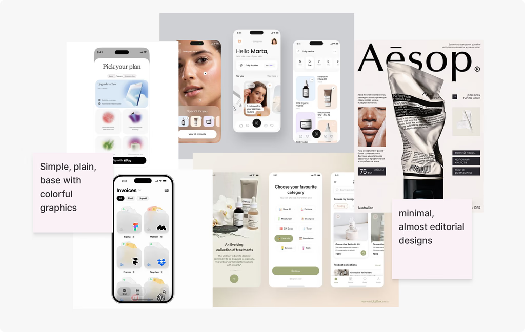
In order to fully understand the vision, I created a mood board. The main inspiration was made of skincare apps and other apps with modern, simplistic UI.
User Flow Chart
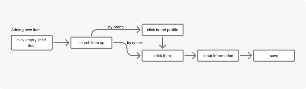
I didn't feel the need to make a chart for every interaction as I already had a pretty good idea of what the app should look like. However, I did make one for some areas where I felt unsure, such as how adding new items to the shelf would look.
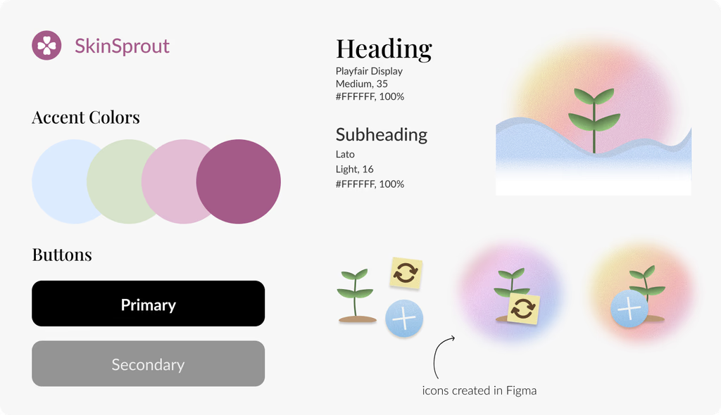
Branding
Wireframing
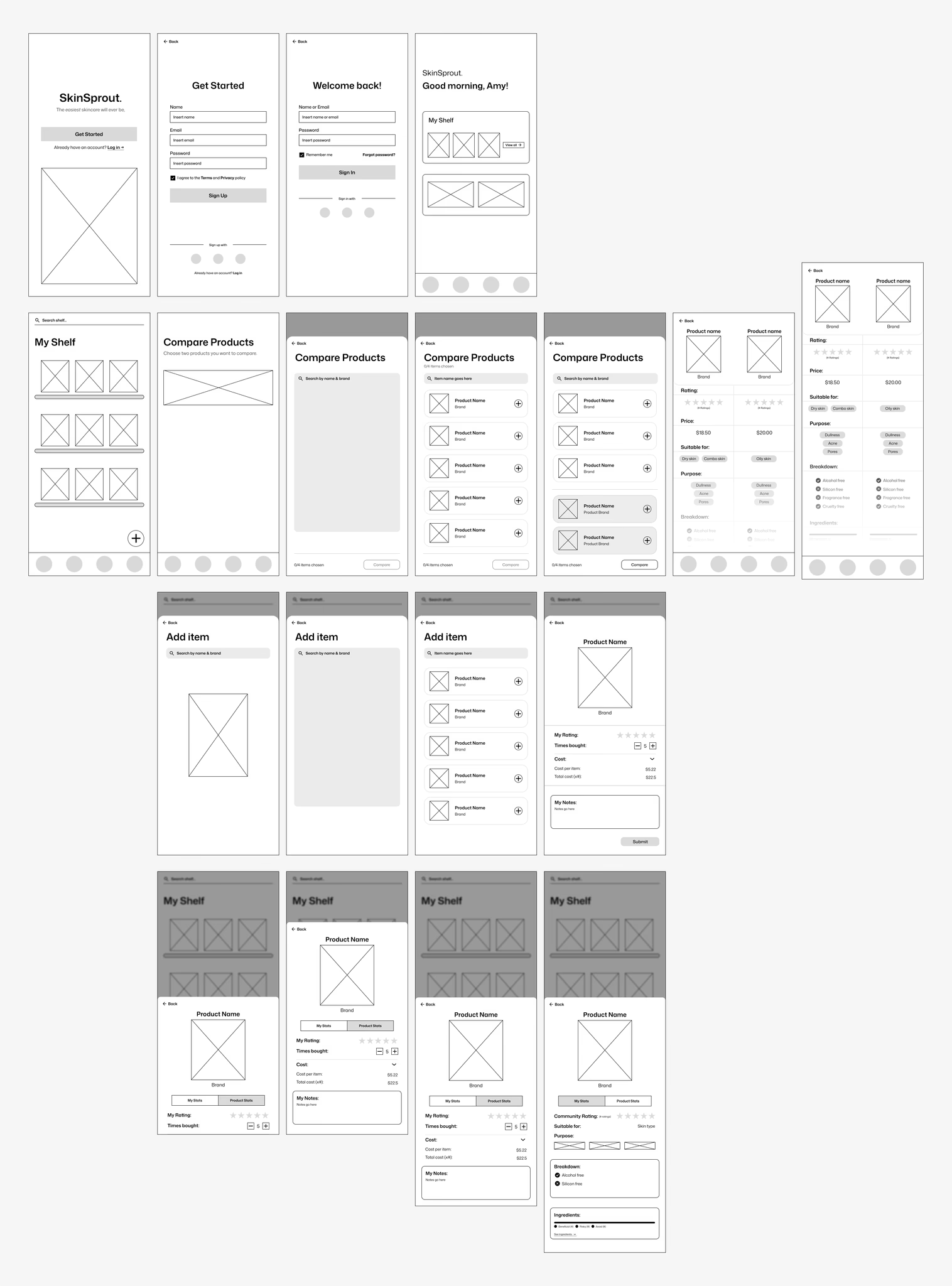
I mapped out the screens + flow using low-fidelity wireframes, ensuring navigation was smooth.
Testing
The low-fi was my first iteration to ensure everything made sense. I tested the flow with 5 users who all know different amounts of skincare.
5/5
Completed the flow without any help.
4/5
found the information easy to read.
3/5
Had trouble editing products inside the shelf.
Design Choices
Navigation problem: Users needed a way to move between stat cards without breaking the visual rhythm of the layout.
Currently, the cards are aligned vertically. Do users swipe, tap, or should they click somewhere else on the screen?
Decision
Despite the vertical arrows having a clear next step, I decided against it because it cluttered the screen too much.
So we went with the no arrow option. Users can swipe or tap to move onto the next screen. The layering is intuitive enough for the next step to be obvious.
05 / Learnings
Research first
This was my first complete solo project. As silly as it sounds, I didn't realize the importance of research in the past (my old workflow was pretty messed up, it was idea → execution → maybe conduct a bit of research to back it up). I now know that research is quite literally the most important step in UX. (Maybe I can even say I'm pretty good at it now.)