
Spotify Guessr
Turn your Spotify Blend into a multiplayer guessing game.
TIMELINE
June 2026
TEAM
1 designer (me!)
1 dev
ROLE
Product design
Visual design
SKILLS
Product design
Branding
01 / Initial Planning
The Problem
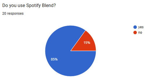
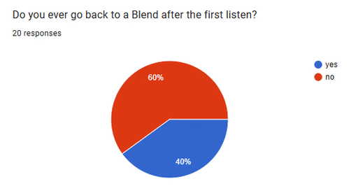
Every Spotify Blend begins with curiosity. People want to know: what's our match percentage? What secret song do we share? But curiosity dies down. By day 2, the playlist lays in your library, forgotten.
The problem isn't Spotify or the Blend itself; it's creating a reason to return.
The Solution
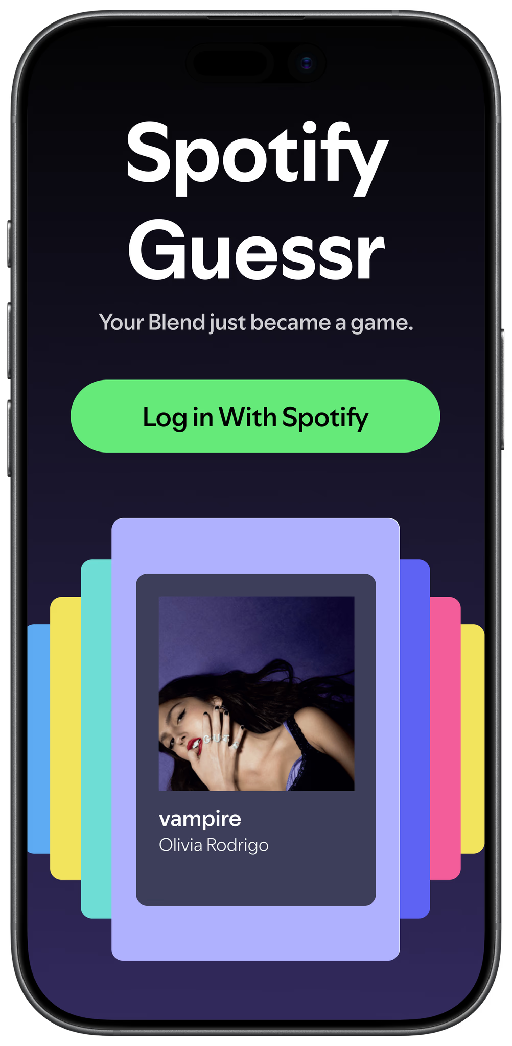
A webapp that turns your Spotify Blend into a minigame — just sign in, play a song, and guess whose it is!
The Brief
I structured this project as a simulated client engagement, where my dev was the client and provided me with requirements.
I asked him a set of questions to make sure I fully understood the vision, then split them into 3 categories. This allowed me to visualize the product and begin my research.
Flow
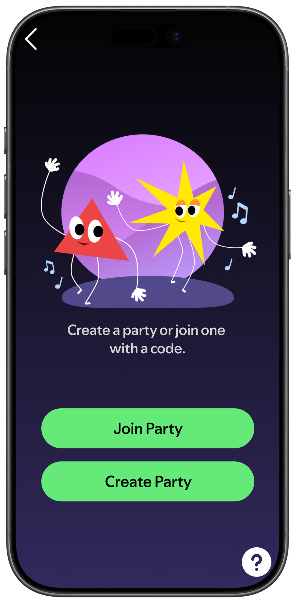
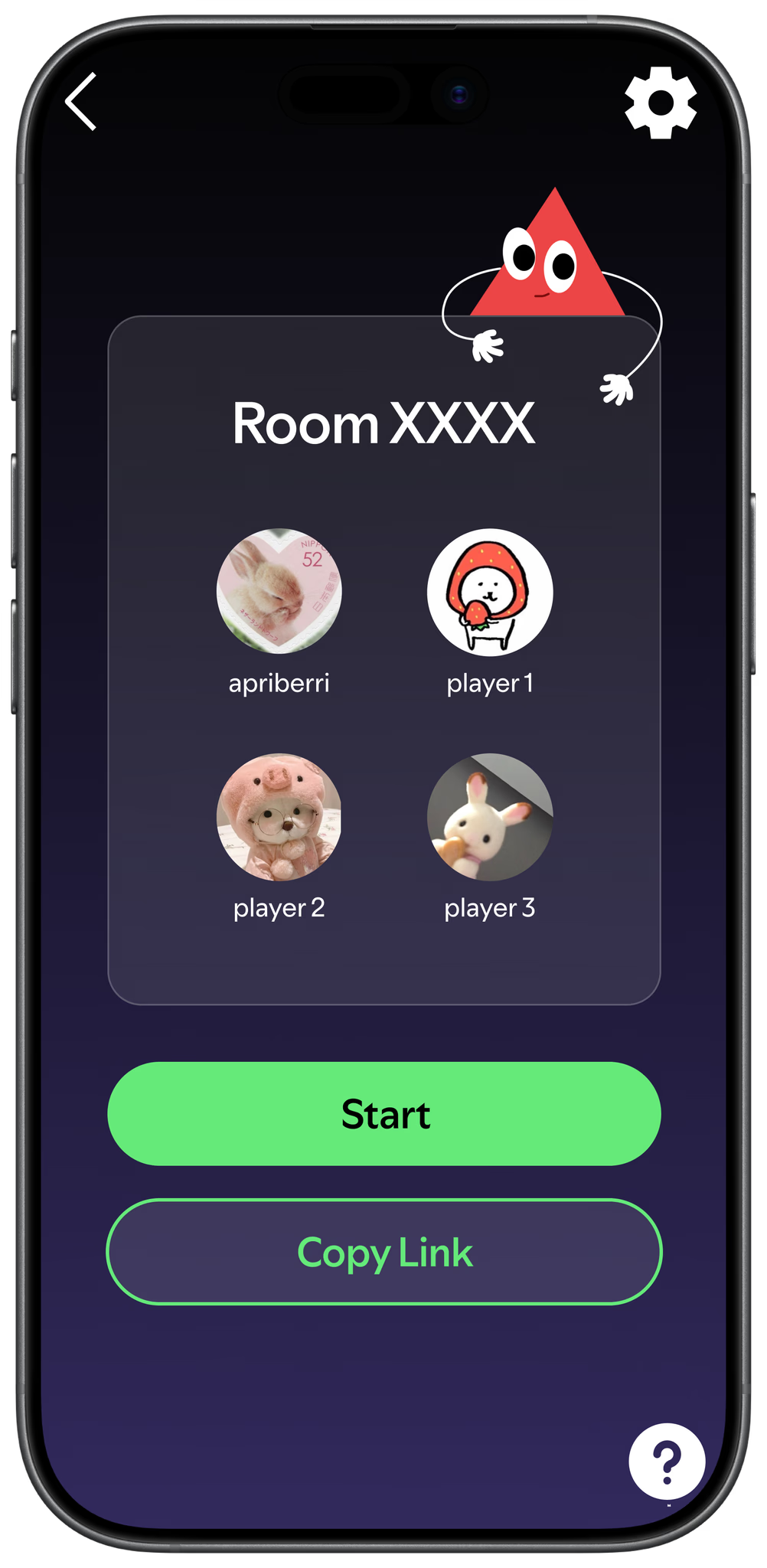
- someone creates a room
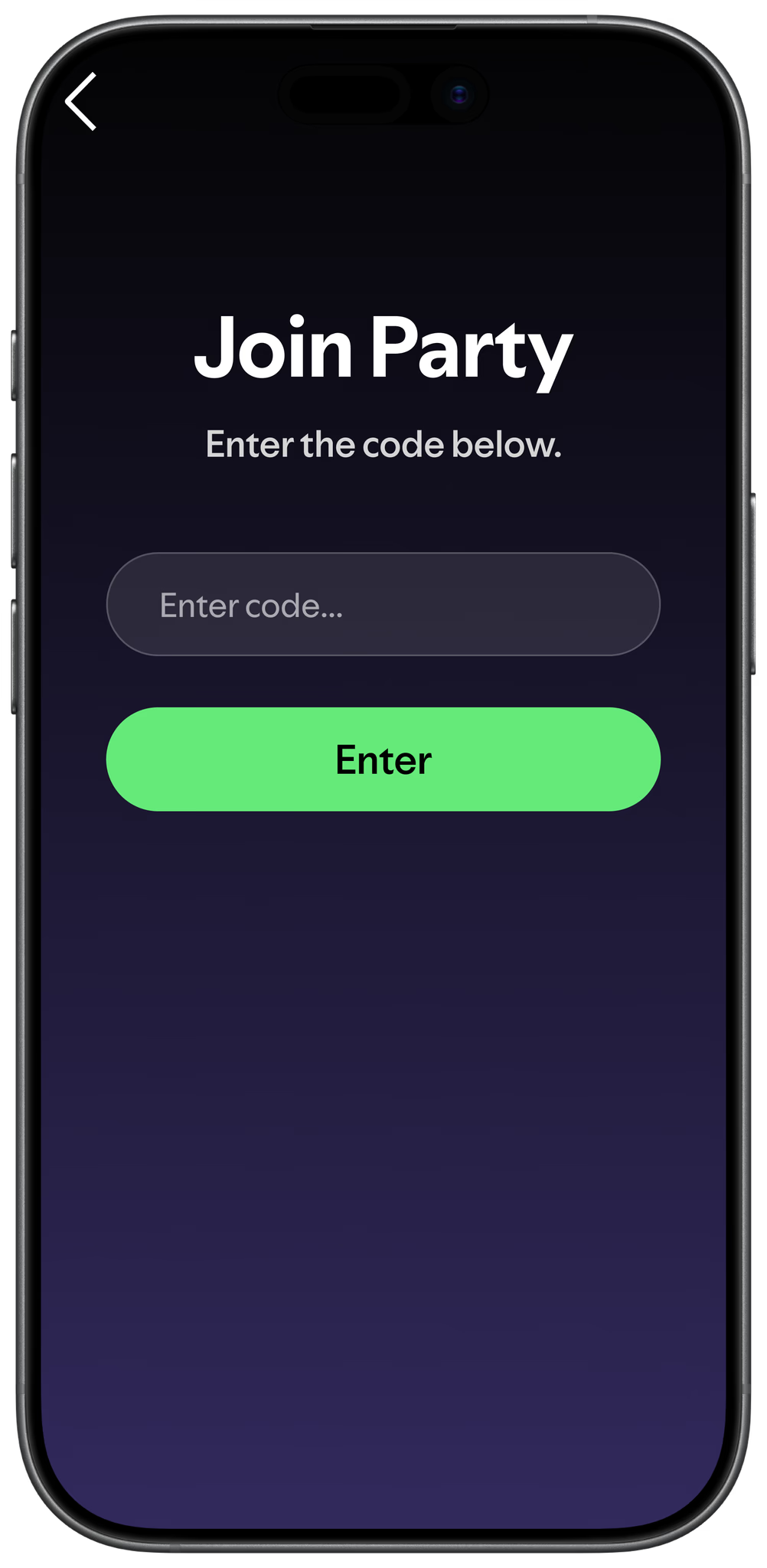
- room code → use to join room
- start game after everyone joins
- game begin
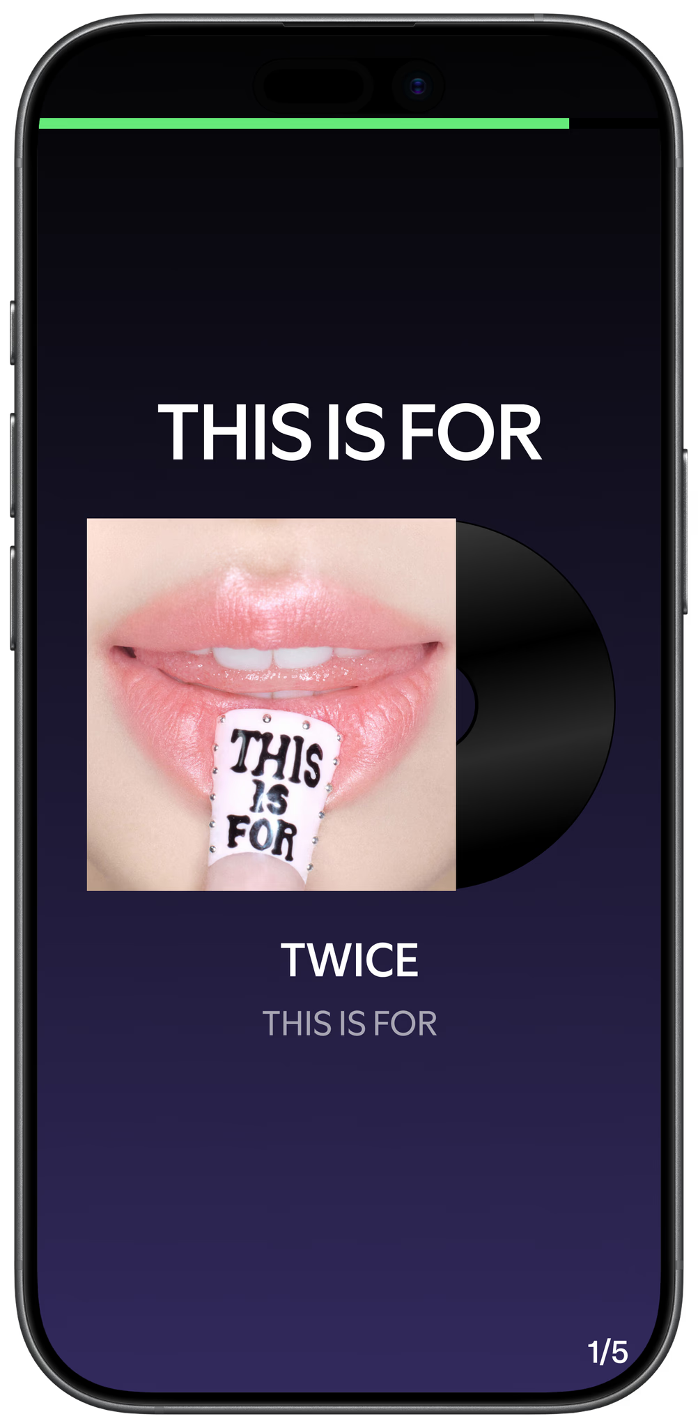
- play song
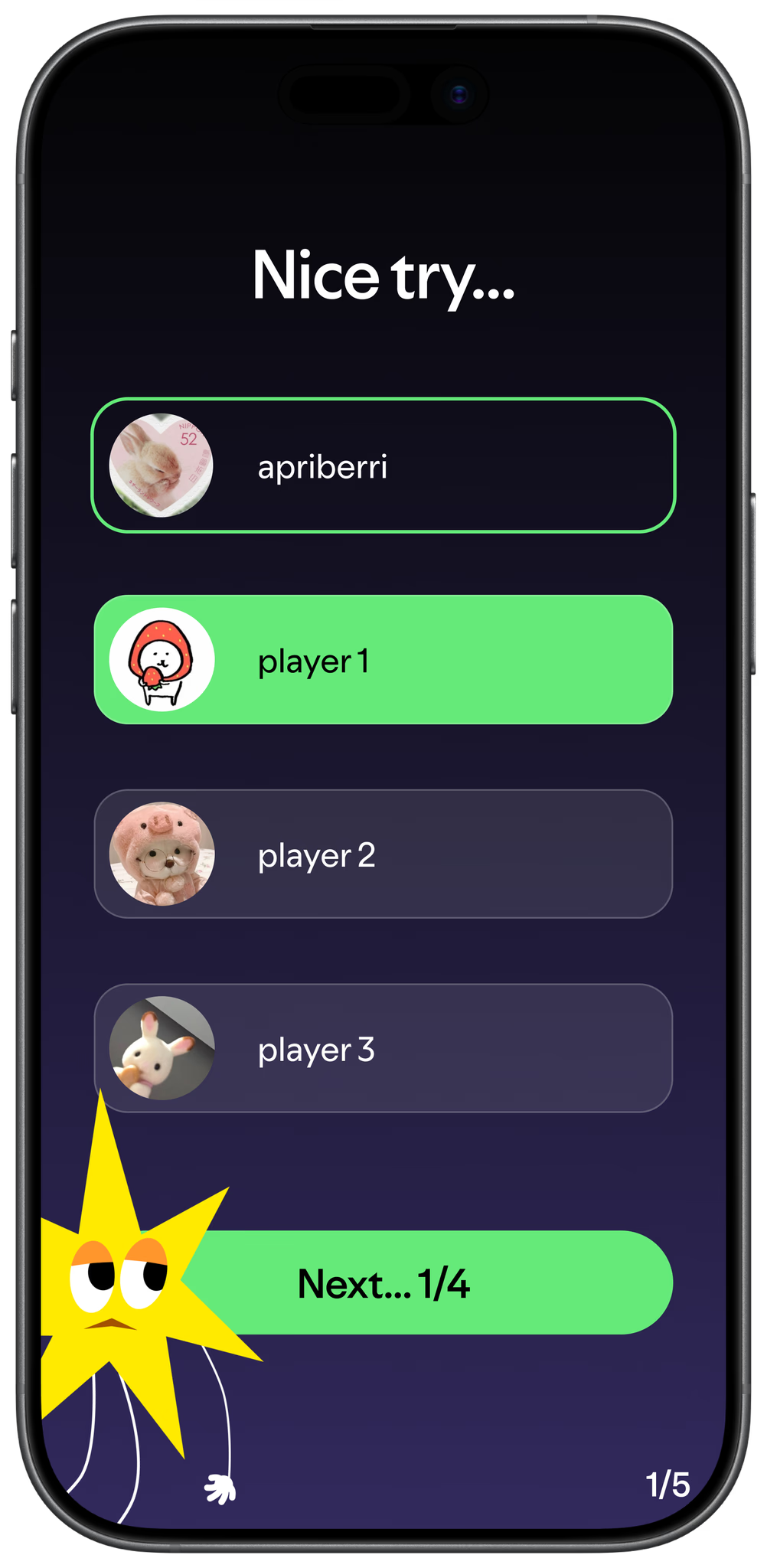
- list players
- pick who the song belongs to
Mechanics
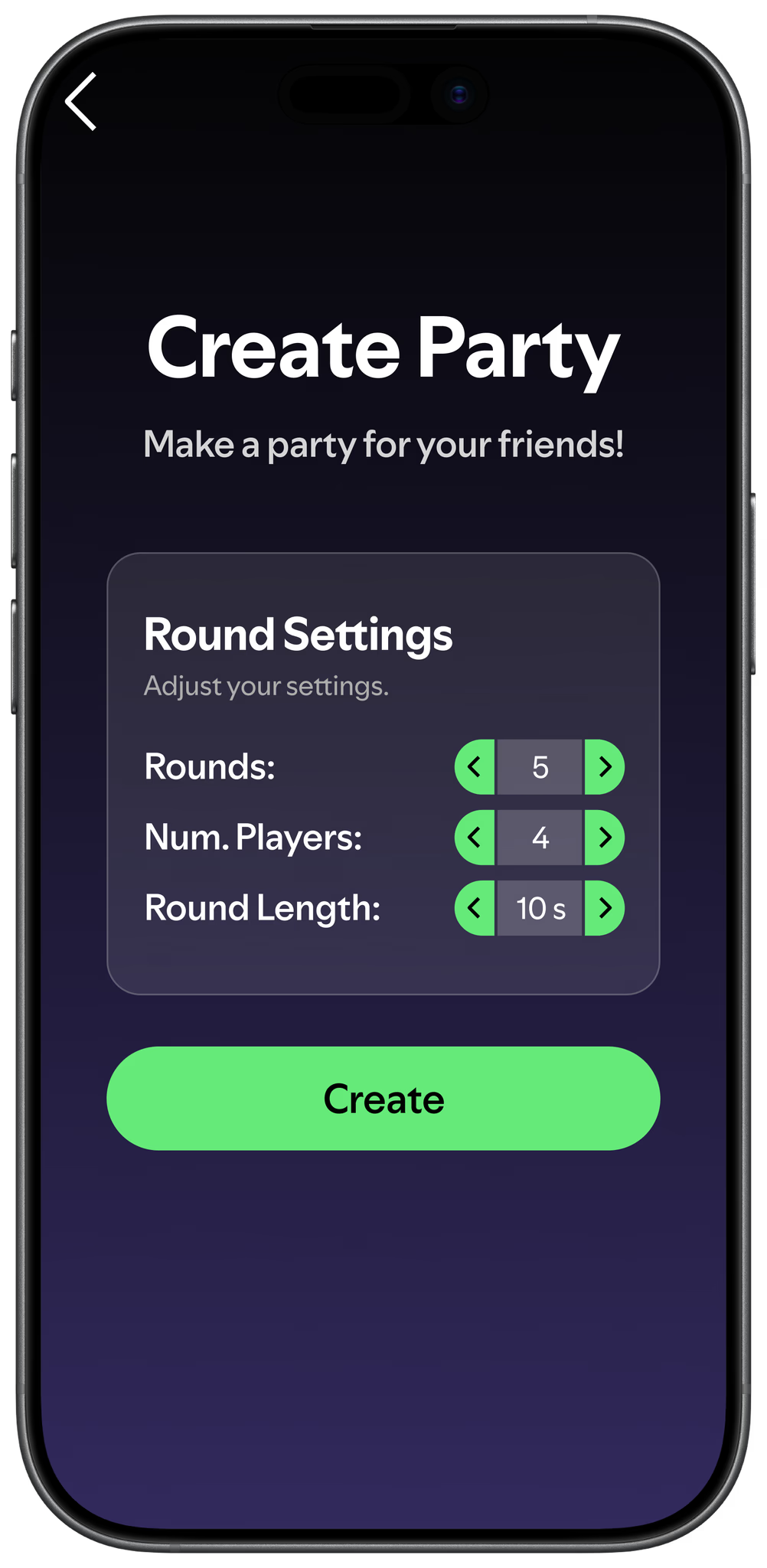
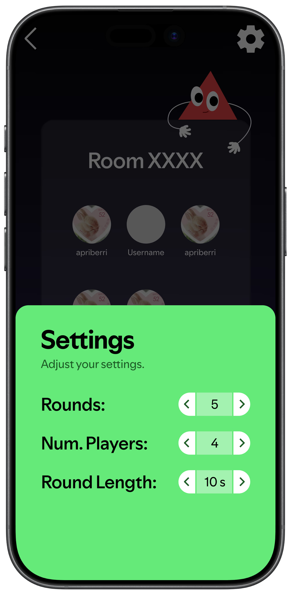
- user chooses # rounds
- default = 10 songs
- rounds based on # songs
- every correct guess = 1 point
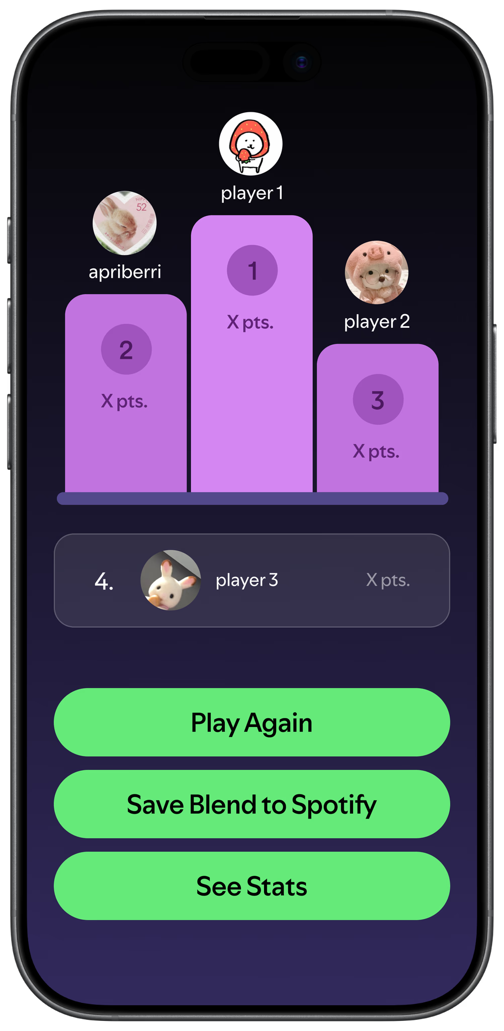
- first person gets most — top 3
Game
- audience: teens+
- no account
- no player limit
- spotify stats showing at the end of the game
- spotify wrapped?
- spotify compatibility
- x and y listen to this genre
- designed for mobile but can also play on desktop
02 / Research
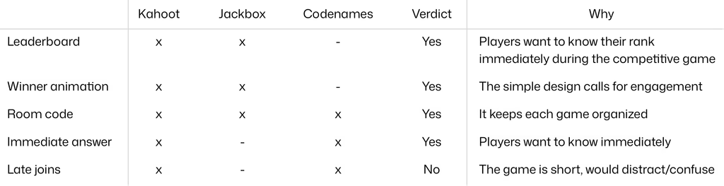
Competitive Analysis
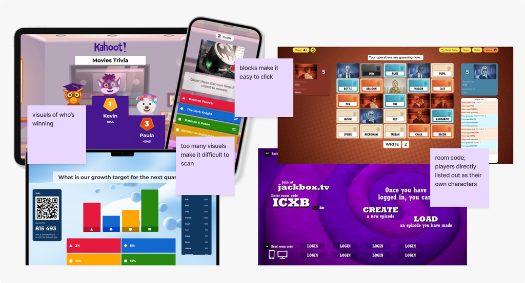
I compared several existing products to analyze what currently works and what doesn't.
Affinity Mapping
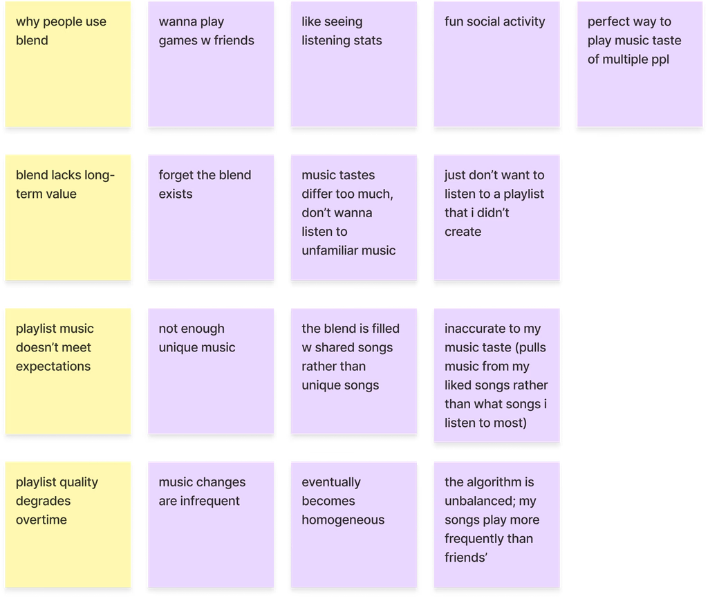
Through analysis of 20 user survey responses (aged 17-24), I mapped out the responses to better understand the problem.
4 Key Insights
Blend misrepresents actual listening taste
Spotify Blends lose user trust because they don't accurately depict users' music tastes, choosing shared songs over unique music.
Blend quality decays the longer it's used
Infrequent updates and an unbalanced algorithm (one friend's plays dominating) make Blend feel increasingly homogeneous and unrepresentative over time.
Blend's value is social, not musical
Users are drawn to Blends for the shared experience, where they compare statistics, music, etc. Losing the social hook kills engagement.
Lack of long-term draw
Blend playlists are no longer relevant when the social factor is gone; users prefer listening to their own playlists, causing them to become irrelevant quick.
Problem Statement:
How might we extend the social excitement of Spotify Blend beyond the first interaction?
03 / Design Process
Challenge
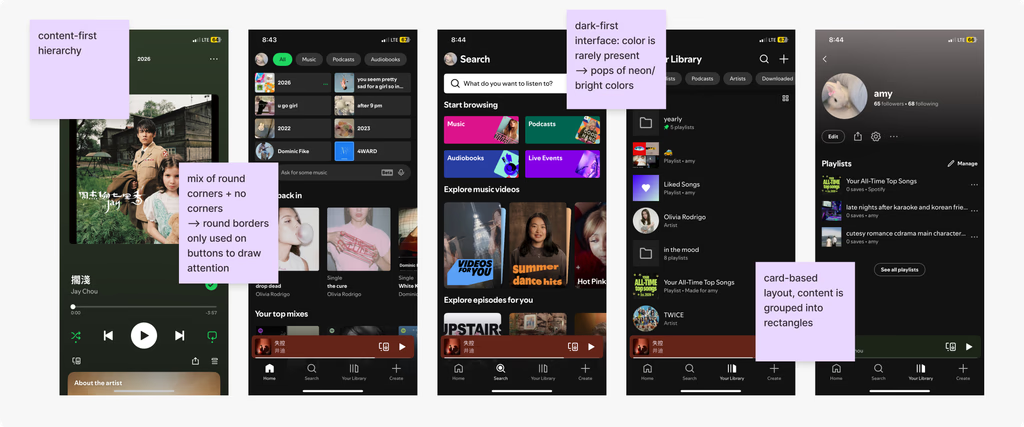
How do we make the product familiar to Spotify while also resembling its own creation?
Spotify's Design System
Spotify's Main App
Spotify Wrapped
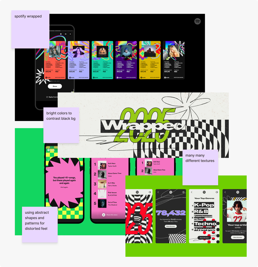
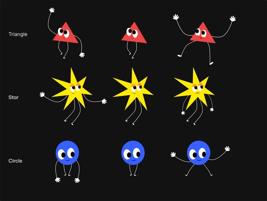
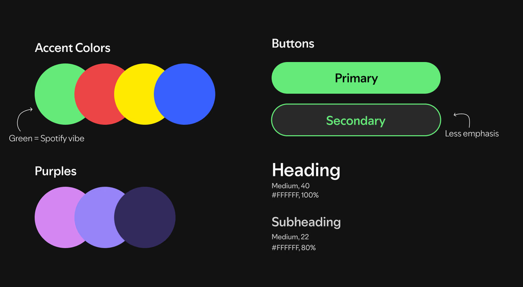
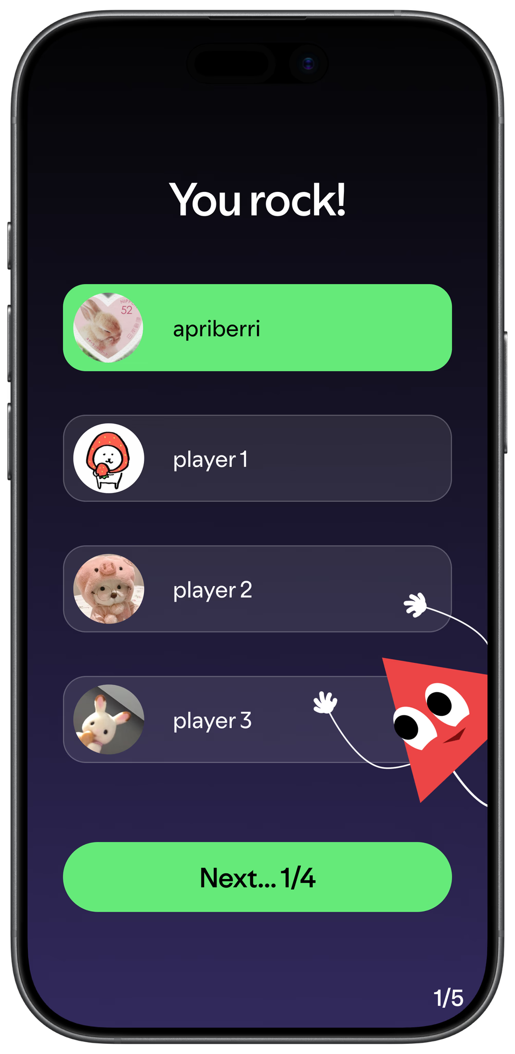
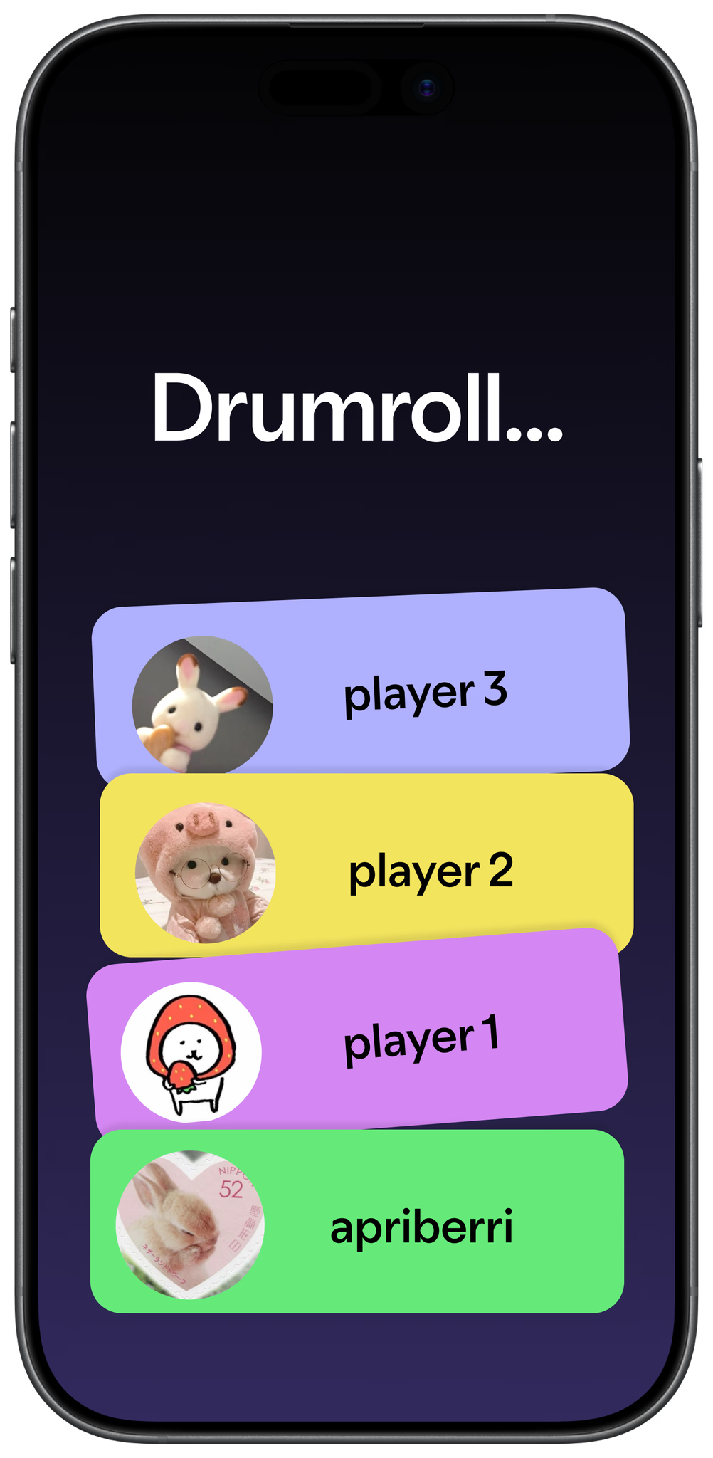
Familiarity was easy; I decided to stick with Spotify's iconic green as an accent color. I emulated the chaotic vibe of Wrapped with pops of neon, shapes, and by creating mascots.
Branding
Mascots
Color Scheme
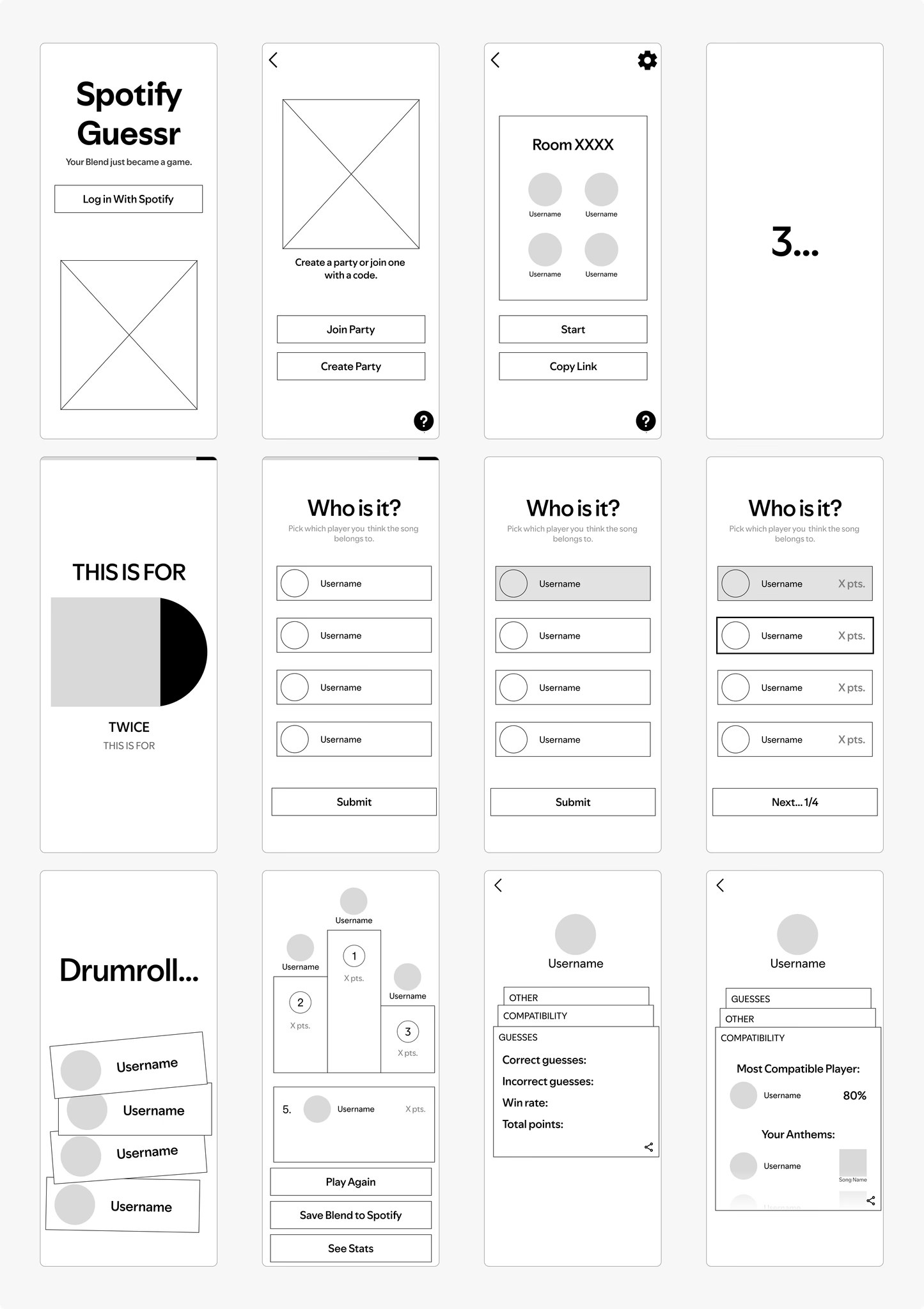
Wireframing
I mapped out the screens + flow using low-fidelity wireframes, ensuring navigation was smooth.
Navigation Problem
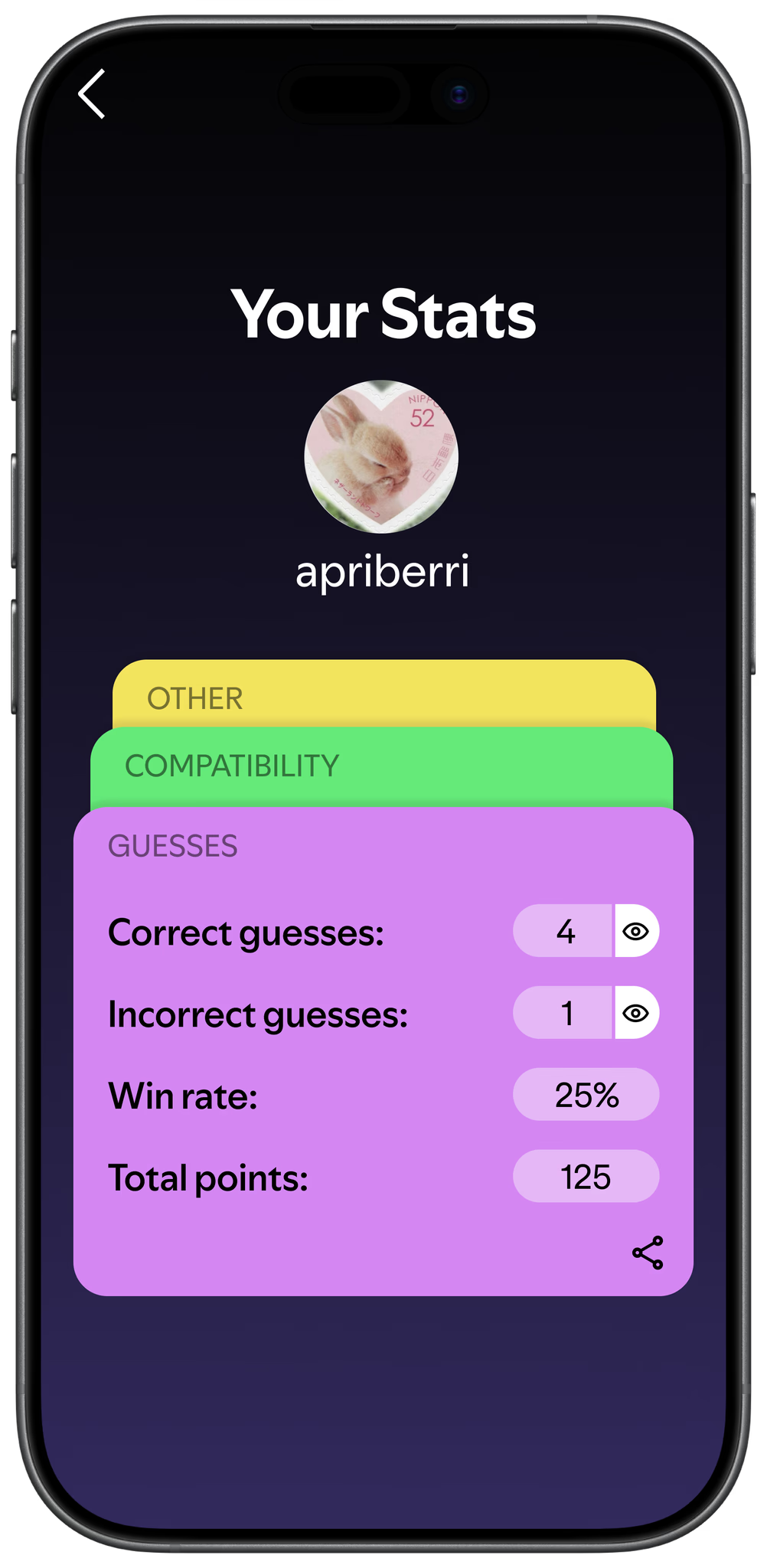
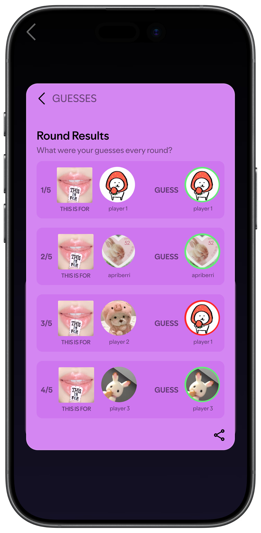
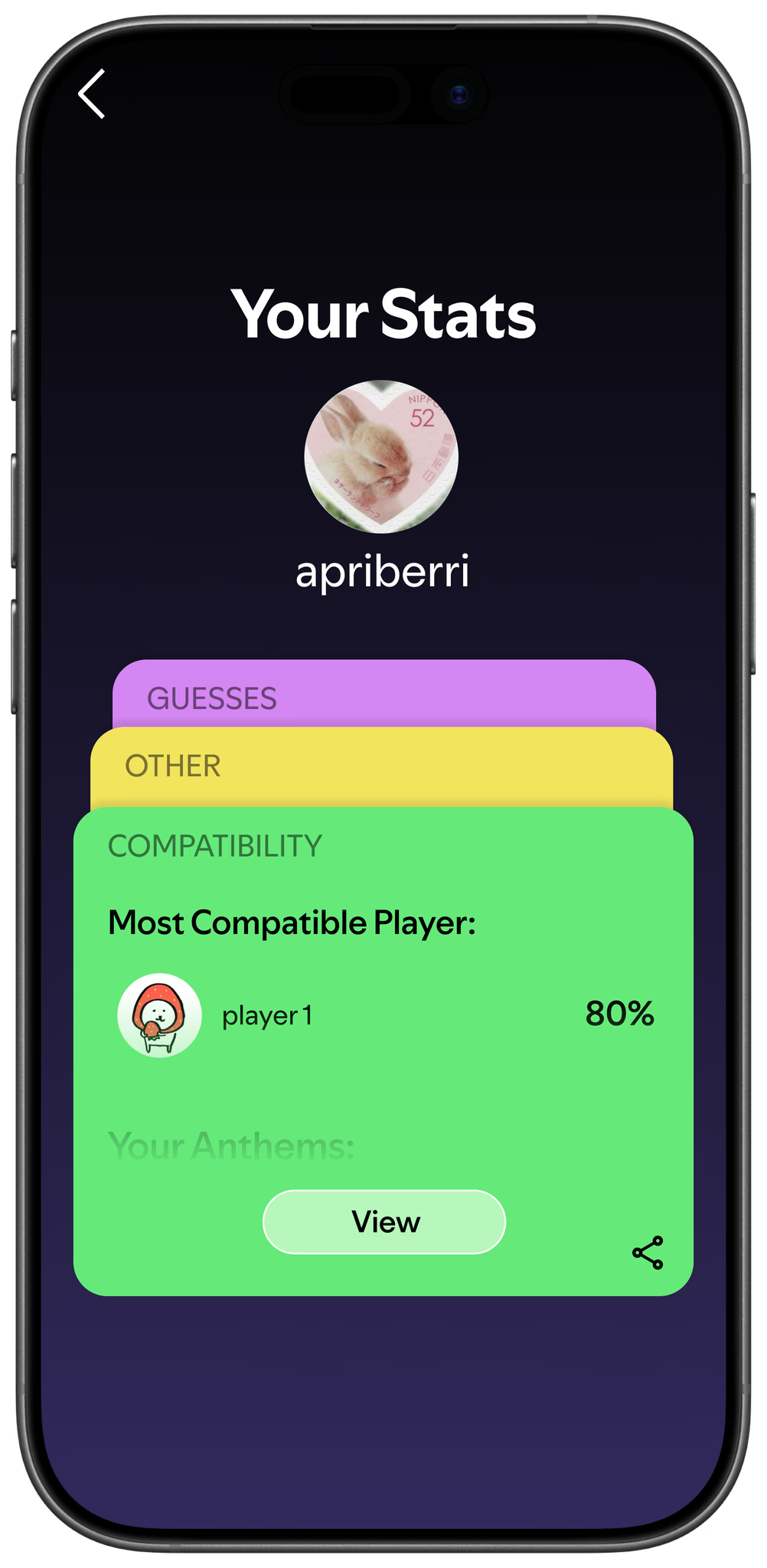
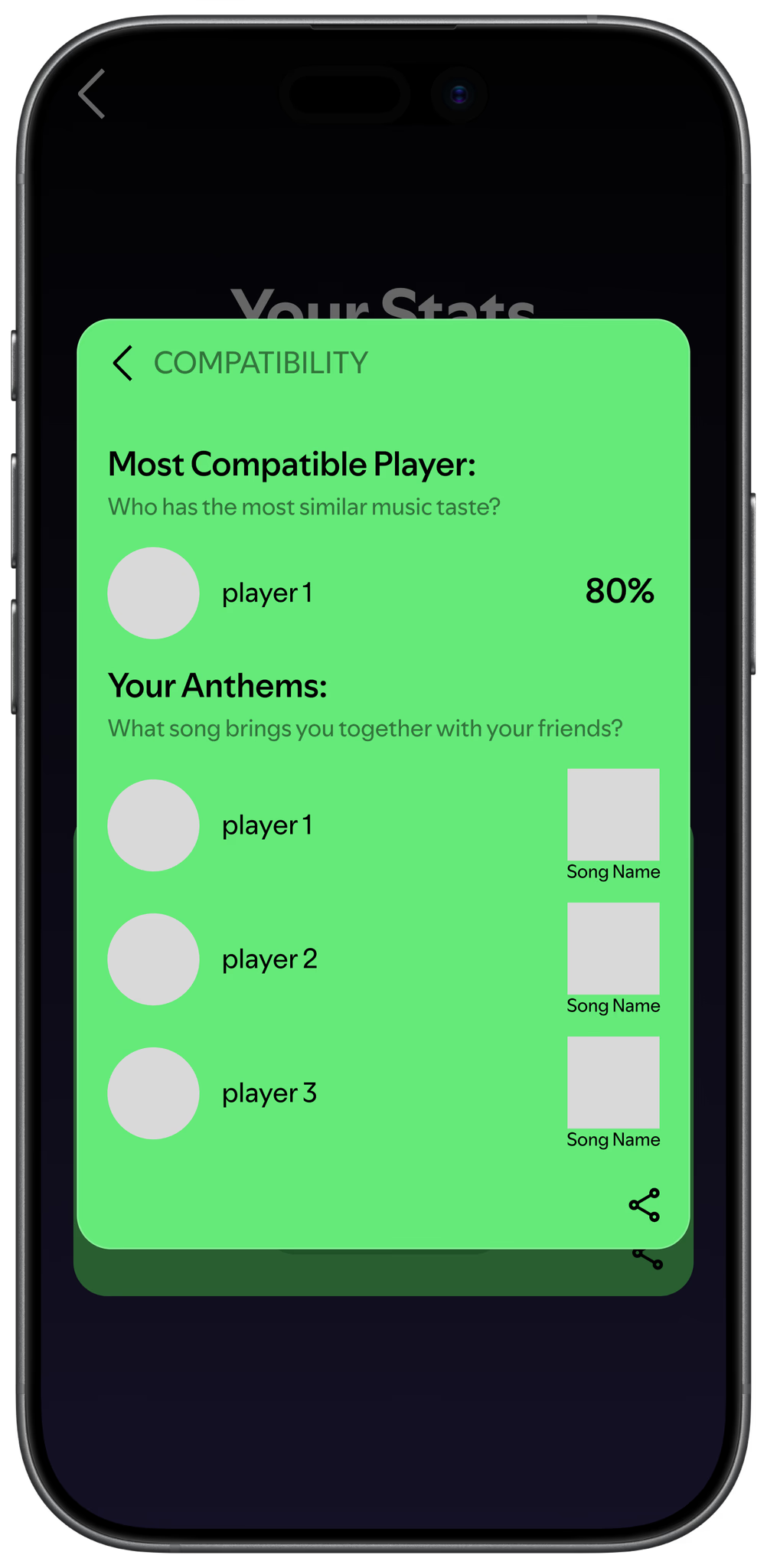
Users needed a way to move between stat cards without breaking the visual rhythm of the layout.
Currently, the cards are aligned vertically. Do users swipe, tap, or should they click somewhere else on the screen?
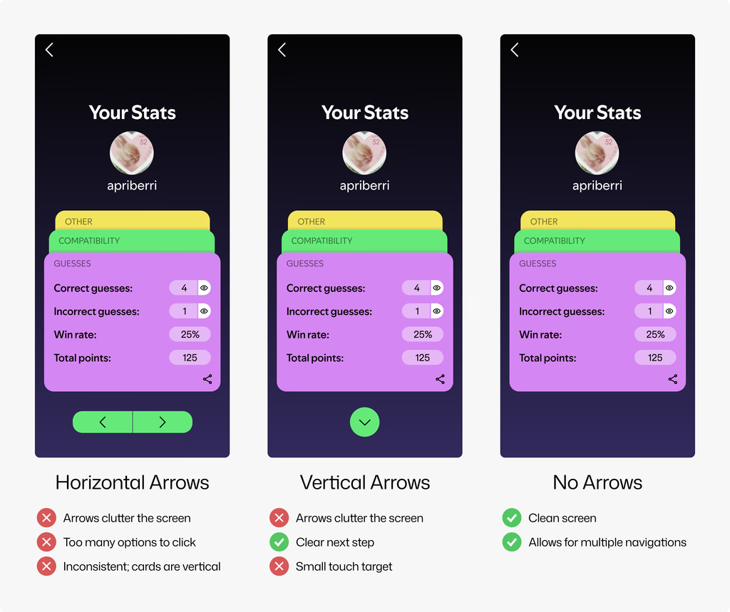
Decision
Despite the vertical arrows having a clear next step, I decided against it because it cluttered the screen too much.
So we went with the no-arrow option. Users can swipe or tap to move onto the next screen. The layering is intuitive enough for the next step to be obvious.
05 / Learnings
Working with a client
As the designer taking on a client, it is important to understand ALL of their needs & expectations! This means ensuring that you are communicating throughout the process, checking in to make sure everything is okay, and consistently asking questions.
Sometimes, the client doesn't have a tech background and will not understand the plausibility of certain features. Other times, they will not be able to communicate what they don't explicitly like about a design. As the sole product designer, it was my job to make sure I was transparent and created something that met the client's standard!